INFOCUS NEWSLETTER
Join 45,000+ other photographers and get the Free eBooks, Free Creativity Course & Discount Codes right in your inbox.
Note: We never share your email address with anyone. More Info.
Join 45,000+ other photographers and get the Free eBooks, Free Creativity Course & Discount Codes right in your inbox.
Note: We never share your email address with anyone. More Info.
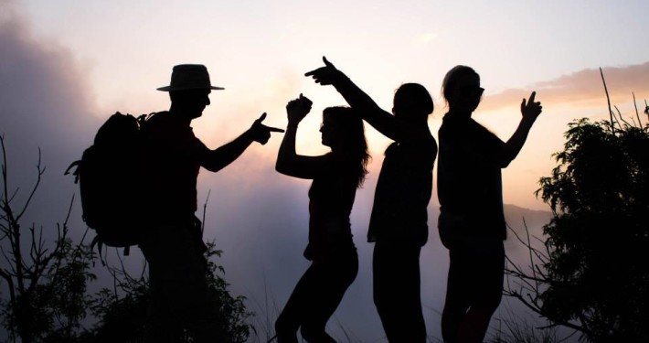
Jay Patel embarks on a whimsical journey of the aspiring social media photographer’s quest for social media stardom and self-discovery.
Email Policy | Privacy Policy | Terms
Join 45,000+ other photographers and get the Free eBooks, Free Creativity Course & Discount Codes right in your inbox.
NATURE PHOTOGRAPHY NEWSLETTER ![]()
![]() Get free webinar invites, photography tips, free eBooks and more right in your inbox.
Get free webinar invites, photography tips, free eBooks and more right in your inbox.
We never share your email address with anyone. More Info.


